-
The first personal computer was introduced in 1975 and since then has spread rapidly into most every home today.
There are now small but powerful computers in phones, PDAs, cars, you name it, each with the capacity to record and communicate information about you.
The internet connects us and wireless access is becoming standard. At the same time, technologies for data collection are undergoing major revolutions.
- The complexity and size of data, our ability to measure and record phenomena related to our physical (and virtual), surroundings are at an all time high
- Computing has revolutionized the practice of statistics in genetics, envirionmental/habitat monitoring, clinical trials and the health services; and has given rise to new areas like bioinformatics
- In turn, data and data processing has profound implications for how we experience the world; our movements and behaviors are often mediated by data flow
- Education - measurement and data analysis are having a huge impact on the way curricula are generated
- Health Care - New diagnostic and testing equipment generate rich sets
of complex digital data; all of the devices in a modern
hospital room can be accessed and monitored remotely,
their data stored in electronic versions of a patient's chart called the Electronic Medical Record (EMT).
Congress has looked into regulating flows of data related to healthcare because of the many positives:
EMRs ride on a large quantity of complex data describing
how health care is delivered
Checks can be put in place to catch errors or redundant orders; patients can be better monitored and tracked
At the same time, by comparing patients admitted with similar symptoms, a new kind of evidence-based practice emerges; there are interesting legal questions here
Similarly, there is a move to compare doctors and the kind of care they provide; HMOs, for example, offers bonuses to doctors if they prescribe adequate preventative care and new flows of data emerge to support doctors - Social Trends - Our online experience is entirely mediated by data flow. Each page we download, each email we send, our social connections and blog entries, our contributions to chat rooms and bulletin boards all live in someone's log file. Your online purchases are also equally open to examination. The analysis of all this information is also statistics
Some Examples:
We discussed the impact that computing technologies have had on the practice of statistics. Extending this idea, we found that data collection and data processing are having significant effects on professional practices outside of statistics. In fact, the flow of data shapes our experiences of our physical surroundings; our actions and movements are often regulated by data.
Taking Apart the Data
-
Now, let's look at real data. We will consider a survey administered by the CDC to track personal health behaviors.
We are going to work with a subset of the data (the
complete data set consists of answers from over 300K
people), our sample is too large to understand "manually".
We will explore simple descriptive tools, both numerical
and graphical, that will help us identify structures and
patterns in the data.
- The Behavioral Risk Factor Surveillance System is the world's largest telephone survey; it is designed to track health risks in the United States
- Like many surveys, the BRFSS works with only a sample of a larger population
- With over 200 million adults in the United States, the CDC couldn't possibly contact their entire population; if each questionnaire takes 5 minutes to complete...
- Instead, they selected around 200 thousand adults, calling roughly 15 thousand per month
- There is an implicit hope that the sample of adults identified by the CDC is in some way representative of the larger population within the United States
- If it is, we can begin to infer aspects of the population from the sample
- We do this at least informally every time the press reports the President's approval rating or we hear about the success rate of a new AIDS treatment
- Statistical inference is the process of drawing conclusions about a population, based on a observations in a sample from that population
- Modern inference often involves various phases of exploratory data analysis
- Here, numerical and graphical descriptions of the data are used to help us uncover patterns, to get a sense of what the data look like
- The variables genhlth, state and gender are all categorical; genhlth is ordinal, but state and gender are nominal
- The variables age and sprawl are quantitative; age is discrete and sprawl is continuous
- Our data set has a sample size of 20 thousand
The BRFSS
THE BIGGER PICTURE
Our Data
The BRFSS consists of responses from 200 thousand people, we will only look at a subset (another sample, if you will) of 20 thousand people. Here are the first ten responses in our data set; each row refers to a different person and each column to their response to a given question.
   state genhlth physhlth exerany hlthplan smoke100 height weight wtdesire age gender sprawl
1     22      good     0        0        1        0      70    175    175    77    m 77.27268
2     25      good     30       0        1        1      64    125    115    33    f 45.72318
3     6       good     2        1        1        1      60    105    105    49    f 48.73611
4     6       good     0        1        1        0      66    132    124    42    f 14.21793
5     39 very good     0        0        1        0      61    150    130    55    f 61.64302
6     42 very good     0        1        1        0      64    114    114    55    f 57.74011
7     6  very good     0        1        1        0      71    194    185    31    m 48.73611
8     48 very good     1        0        1        0      67    170    160    45    m 45.03769
9     6       good     2        0        1        1      65    150    130    27    f 32.24949
10    48      good     3        1        1        0      70    180    170    44    m 45.87459
Variables
-
state
every state but Alaska is represented in our data set
genhlth
respondents were asked to evaluate their general health values are excellent, very good, good, fair, poor
physhlth
The number of days out of the last 30 that the respondent was in poor health
exerany
1 if the respondent exercised in the last month and 0 otherwise
hlthplan
1 if the respondent has some form of health coverage and 0 else
smoke100
1 if the respondent has smoked at least 100 cigarettes in their entire life and 0 otherwise
height
in inches
weight
in pounds
wtdesired
desired weight in pounds
age
in years
gender
labeled "f" and "m"
sprawl
a variable not originally included in the BRFSS, but added by a research at JHU; it ranges from 0-100, with low values indicating densely populated regions and high values indicating urban sprawl (New York City = 6.7, L.A = 10.6, and Atlanta = 80.7)
A variable is a characteristic of a person or thing that can be assigned a number or a category
Depending on the characteristic being observed, variables can be either categorical or quantitative
In turn, categorical variables can be either ordinal or nominal; and quantitative variables can be either continuous or discrete
These distinctions often inform the kinds of summaries or displays that are appropriate for the variable
A sample is a collection of persons or things on which we measure one or more variables
The number of items in the collection is known as the sample size
Some Examples:
Graphical Displays
A frequency distribution is a display of the frequency or count of all the values in a sample; it is often tabular or graphicalFor categorical variables or discrete variables with a small number of values, this idea makes sense; for continuous variables we might consider grouping the data in some way
Graphical Displays for Categorical Variables
A bar graph can be formed to make comparisons easier.
Figure 1-2: This is a bar graph, using SPSS. A pie chart should not be used for this data since the number of deaths for all causes of death are not known or not given.
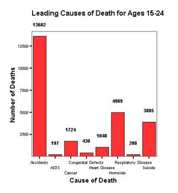
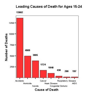
A pareto chart is a bar graph that orders the levels of a variable from highest to lowest (by frequency or relative frequency)
Figure 1-3: This is the same data used in Figure 1-3. A bar graph that is ordered from tallest to shortest bar is called a pareto chart.
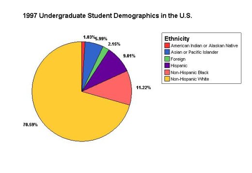
A pie chart shows the percent or proportion (by pie slice) of the whole pie each group forms
NOTE: Use a pie chart only when the categories include all possible values.
Figure 1-4: This is a pie chart, using SPSS. Since all categories are represented (each undergraduate student falls into one category) a pie chart is appropriate. A bar graph would also be suitable for this data.
Graphical Displays for Quantitative Variables
A stemplot is useful for displaying small or moderate-sized data sets - each observation can be identified to some degree
Figure 1-5: This is a stemplot for IQ of 32 Seventh-grade Females.
Stem-and-Leaf Plot for
GENDER= F

 Frequency    Stem &  Leaf

     2.00        7 .  24
     2.00        8 .  69
     5.00        9 .  13368
     9.00       10 .  023334578
    10.00       11 .  1122244489
     2.00       12 .  08
     2.00       13 .  02

 Stem width:   10
 Each leaf:       1 case(s)
A histogram is useful for large datasets. It places each observation into a bin or interval - each observation cannot be identified (usually)
Figure 1-6: This is a histogram of IQ from Figure 1-1, using SPSS
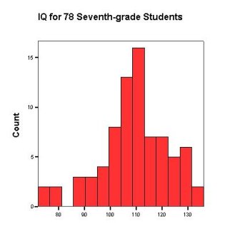
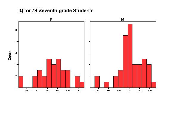
Figure 1-7: These are histograms of female and male IQ from Figure 1-1. Graphs of this type are useful for comparing the distributions of a quantitative variable (GPA) for different values of a second variable (gender).
Boxplots we will talk about in Lecture 2.
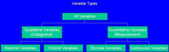
A last look at the different types of variables.
Figure 1-8: Overview of Variables
Distribution of a Variable
Use graphs as a way to determine the distribution of variables- Shape - usually distribution shape is described as symmetric, skewed left of skewed right
- Symmetric - classic definition of symmetry, however since histograms and stemplots are based on a "small" amount of information; exact symmetry is uncommon from a histogram or stemplot if a distribution is symmetric, then mean = median (see 1.2)
- Left-Skewed - when the left tail is significantly longer than the right tail also known as negative skewness - if a distribution is left-skewed, then mean < median (see 1.2)
- Right-Skewed - when the right tail is significantly longer than the left tail also known as positive skewness - if a distribution is right-skewed, then mean > median (see 1.2)
Figure 1-9: Stemplot for IQ of 46 Seventh-grade Males
 Stem-and-Leaf Plot for
GENDER= M

 Frequency    Stem &  Leaf

     2.00 Extremes    (=<79)
     1.00        9 .  0
     2.00        9 .  77
     4.00       10 .  0234
     9.00       10 .  556667779
    11.00       11 .  00001123334
     6.00       11 .  556899
     5.00       12 .  03344
     5.00       12 .  67788
      .00       13 .
     1.00       13 .  6

 Stem width:   10
 Each leaf:       1 case(s)
Figure 1-10: Stemplot for GPA of 78 Seventh-graders
 Stem-and-Leaf Plot

 Frequency    Stem &  Leaf

     2.00 Extremes    (=<1.8)
     1.00        2 .  4
     4.00        3 .  4689
     4.00        4 .  0678
     4.00        5 .  0259
     7.00        6 .  0001249
    22.00        7 .  1122344555566668888999
    15.00        8 .  001111223378899
    15.00        9 .  011133445555679
     4.00       10 .  1577

 Stem width:   1.00
 Each leaf:       1 case(s)
Figure 1-11: Histogram of amount spent by 50 supermarket shoppers (in dollars).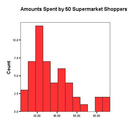
Modality - the mode is the value(s) in a distribution that occur(s) most frequently - graphically, this is the highest bar or peak in the graph
A distribution with one (significant) mode is called unimodal
A distribution with two (significant) modes is called bimodal; other types of modality follow similarly.
A categorical graph will have a modal class instead of a mode.
- Outliers - any values that fall far away from the rest of the data
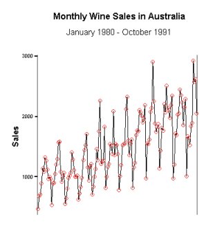
Time Series Data
When measurements of the variable(s) are taken over (usually) regular intervals of timeTime Series Plot - a plot of the variable(s) of interest versus time time is always plotted on the horizontal axis and the variable(s) of interest is/are plotted on the vertical axis
- Trend Component (Trend) - when a time series has underlying (constant) increasing or decreasing trend
- Seasonal Component (Seasonality) - when a time series exhibits similar behavior every t time periods
Figure 1-12: Time series plot of U.S. Population each decade (1790-1990).
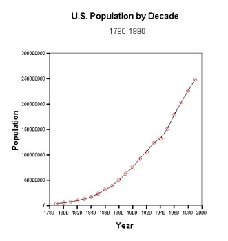
Figure 1-13: Time series plot of monthly accidental deaths (1973-1978).
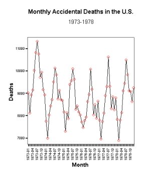
Figure 1-14: Time series plot of Australian red wine sales (January 1980 - October 1991).